Corporate Identity Elements
ERCOT's name, logo, color and typefaces – when used consistently – form a positive visual image unique to ERCOT. A consistent image gives ERCOT a single "voice" or personality. That's efficient and cost-effective, too because each new application, program or presentation builds on an established identity instead of seeking to create a new one.
ERCOT's name, logo and typefaces normally will remain the same for a long period of time. However, our visual style for websites, web applications, annual reports, presentations and other related forms of communication are likely to change every few years as technology and design trends evolve.
Our Name
Although our full legal name is Electric Reliability Council of Texas, Inc., the name we use to communicate is ERCOT. Generally, our full name is used in legal documents, such as contracts and other formal documents, but we use ERCOT in all other communications.
When communicating with an external audience, use the full legal name the first time you reference the organization and use ERCOT for subsequent references.
Our Logo
The ERCOT logo is the cornerstone of our visual identity system. When used consistently in our communications, our logo creates instant recognition. Use the ERCOT logo on the cover, first page or home page of all communications, electronic and printed.
Use the two-color version of the logo whenever possible. Sometimes in print applications, the logo may only be printed in one color. Use the black logo when printing in one color.
The logos shown here are the only correct forms of the ERCOT logo. In the past, the ERCOT logo used a tagline, "The Texas Connection". This tagline is being phased out and should not be used for new communications.
Do not create logos or design marks to represent your department, a program or service. Our visual design system offers ways to customize your communications so they can have a related "family" look within the overall ERCOT identity.
Clear Space and Centering
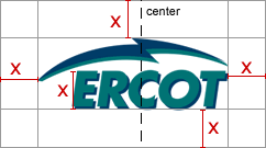
When using the ERCOT logo, allow sufficient clear space around it so the logo is distinctive and stands on its own. The amount of clear space is proportional to the size of the logo. Use the height of the letters as a guide. The illustration below shows the proper amount of clear space.

When centering the logo, use the top of the "arch" as the centering point, rather than the actual center of the image. The optical center of the logo is shown by the dashed line.
Acceptable Background Colors
Always place the logo on a white or light neutral background color. Never use it against a dark background. If you are limited to using the logo in black and white, it may be reversed out against a dark background.
Corporate Colors
The corporate colors used for the ERCOT logo may be expressed in different color systems, depending on the application. If you use the templates provided in these guidelines, you won't need to be concerned with specifying the color. For reference, ERCOT corporate colors are:
| Application |
Format |
ERCOT Blue |
ERCOT Teal |
| Web |
hexadecimal |
#003A66 |
#007B75 |
| Power Point |
RGB |
R:0, G:58, B:102 |
R:0, G:123, B:117 |
| Print |
PMS |
541 |
3282 |
Corporate Typefaces
Because most of our communications are created and distribution electronically, we limit our typefaces to those resident on most office workstations. The three typefaces we use are Arial, Verdana and Times New Roman.
Generally, Arial is used for headings and Times New Roman is used for body copy in most documents. Verdana was created to be a screen font and is often used on websites and web applications for body text, because it is easier to read than a serif typeface.
| Arial Regular |
 |
Verdana Regular |
 |
Times New Roman |
| Arial Italic |
Verdana Italic |
Times New Roman Italic |
| Arial Bold |
Verdana Bold |
Times New Roman Bold |
| Arial Bold Italic |
Verdana Bold Italic |
Times New Roman Bold Italic |

|